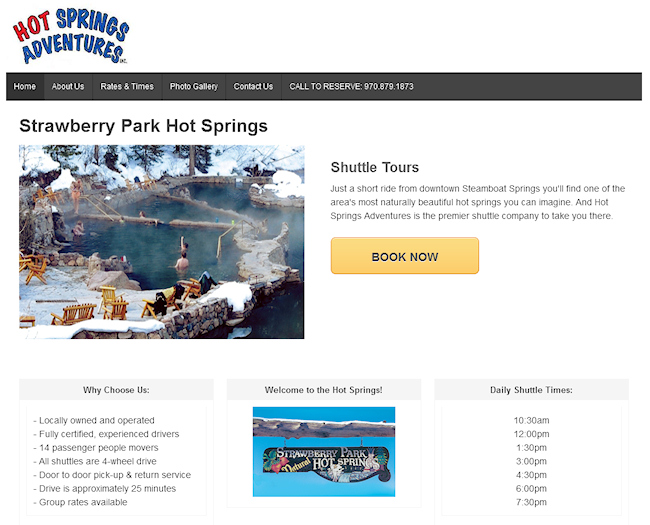
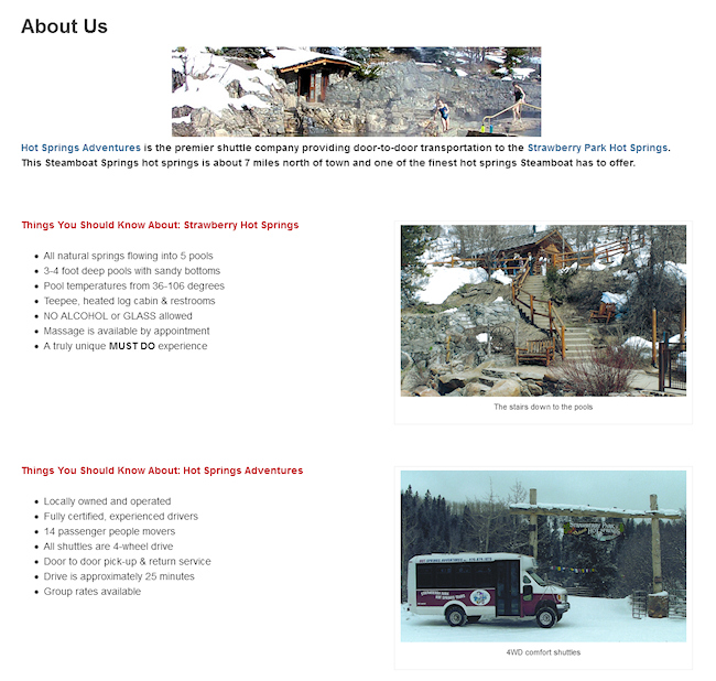
The Hot Springs Adventures website is a good example of extended use of white space to give it a clean, simplified look. The main objective of this site is to give visitors quick access to information like pricing and shuttle times, with an easy-to-find “Contact Us” call to action. There are very few distractions on this site which makes it incredibly effective.

